Tradition and progress
Conceived by innovation, the university with a technological soul emerges as a beacon of higher education. Its brand embodies the fusion of tradition and progress, reflecting academic excellence and cutting-edge technology.
Through a distinctive symbol, it represents the intersection of creative minds and engineering solutions, shaping the future through knowledge. A place where inspiration joins technology, preparing the leadership of tomorrow.
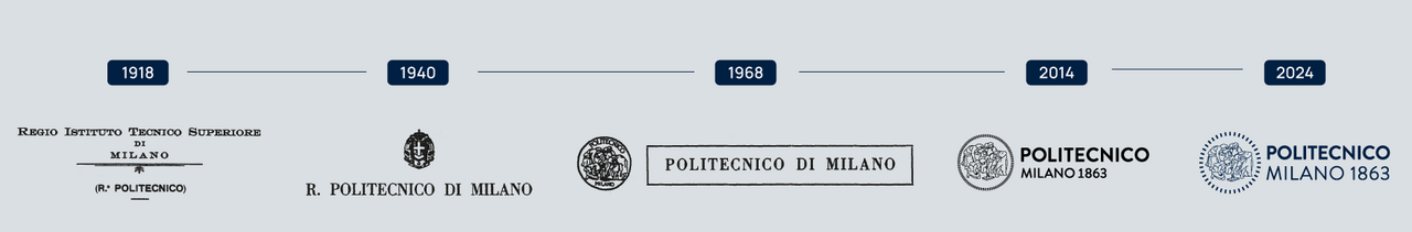
The Istituto Tecnico Superiore - as Politecnico di Milano was called in 1863 - did not have its own logo. The logo that we know today derives from a 1906 medallion which commemorated the didactic jubilee of Giuseppe Colombo, the second Politecnico’s Rector, designed by Luca Beltrami and engraved by Angelo Cappuccio.
The subject portrayed on the back side of the medallion is inspired by the cartoon of the School of Athens by Raphael, frescoed in the Stanza della Segnatura of the Vatican Museums in 1510. The large preparatory cartoon, whose dimensions are 285x804 cm, today preserved in the Pinacoteca Ambrosiana in Milan, unlike the final painting, does not have the background of Renaissance architecture, which is inspired by Bramante’s design for the renewal of the early-Christian basilica of Saint Peter’s, nor the figure of Heraclitus. In particular at the bottom at the right of the work, Raphael portrays Euclide or, according to some, Archimedes looking like Bramante, with some students, while he illustrates a theorem to disciples with the help of a compass.
In 1942 the design of the medallion was officially adopted as the mark of Politecnico and utilized as its raised seal for diplomas. In the 1970’s, the logo was redesigned and stylized: it lost its crown of points and the chiaroscuro of its lines. The version which was redesigned in 2002, is made up of a mark which was inspired by the version of the 1940’s and a logotype ("Politecnico di Milano") written with Futura type.
In 2024 a new revision. The new brand has two formal interventions: the ring has been revised to adapt optimally to different sizes and contexts of use; in the logo the weight of the words "Milano 1863" has been recalibrated to give greater importance to the brand’s heritage.